Removing Operational Bottlenecks at Scale - Eco-Warrior Admin Portal
A web-based admin system that replaced manual onboarding with a self-serve workflow.
Product design of a web-based admin portal that replaced manual, spreadsheet-driven workflows with a self-serve system for onboarding and managing participants.
End to End Design
Corporate Work
UI Design
UX Design
Web Design
System Design
Corporate Work
Project Role:
Product Designer & Researcher
Project Timeline:
July 2024 to August 2024
Project Overview
The Real Problem
The Eco-Warrior Admin Portal is a web-based system designed to support R3 Factory’s Eco-Warrior program.
Before this portal existed, student login credentials were created manually through spreadsheets and email. Teachers depended on internal staff to make updates, which caused delays, repeated back-and-forth, and security risks around shared files. This became especially difficult during time-sensitive periods like the start of a semester.
My goal was to remove this dependency entirely. I designed the end-to-end admin experience to replace a people-driven workflow with a self-serve system that allows teachers to manage onboarding, groups, and roles on their own, while still being flexible enough to scale beyond schools.
Impact
What changed
Manual coordination was replaced with a self-serve system that teachers could use independently.
What this enabled
Internal staff workload was reduced by 85% by removing manual credential creation
Teacher onboarding became 40% faster through bulk upload and at-a-glance visibility
Fewer delays and handoffs during semester starts, reducing operational risk
These outcomes were observed after rollout and onboarding, with continued support for edge cases and technical issues.
Final reflection
This project reinforced how important it is to design for real constraints. The goal was not perfection, but reliability, clarity, and speed.
Shipping a system that people can actually use under pressure mattered more than adding features that looked impressive but solved smaller problems.
What I chose not to build
What was intentionally left out I did not design advanced customization, automated onboarding flows, or role-specific dashboards beyond what was essential. Why I made that call This was an MVP under time and development constraints. Adding more features would have increased complexity without solving the core operational problem. What this protected Focus. The system shipped with the features that removed the biggest bottlenecks instead of trying to do everything at once.
What I learned
What this project reinforced Designing systems is often about removing work, not adding features. The most valuable changes were the ones that reduced dependency and coordination. What changed in how I work I became more comfortable making trade-offs early and committing to them. Not every improvement needs to be designed in the first version.
What I would do in the future
What I would revisit later With more time and data, I would explore lightweight onboarding guidance and clearer system feedback for first-time users. Why this was not included Teachers were already familiar with similar admin tools, and manual onboarding was sufficient for this version. It was more important to ship a reliable system than a polished onboarding flow.
Key Design Decisions
The main challenge in this project was not visual complexity. It was operational friction.
I had to make practical decisions under real constraints. Time was limited, development resources were shared, and the system needed to work immediately once it shipped.
The decisions below reflect how I approached reducing dependency, removing bottlenecks, and designing a system that could scale beyond a single use case.
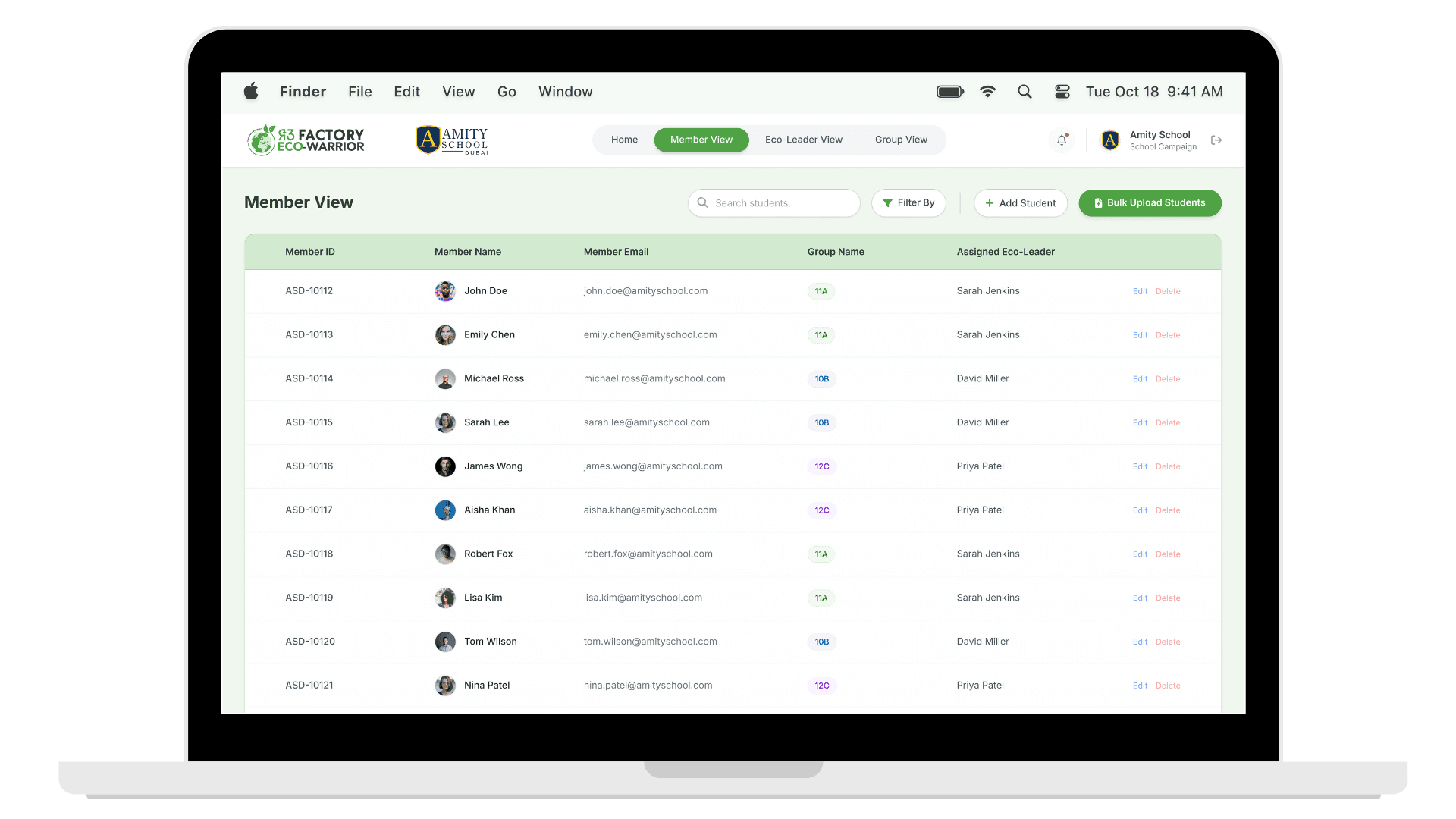

Prioritizing bulk upload
What changed Bulk upload was designed as the core action of the system instead of one-by-one account creation. Why it mattered Onboarding happens under time pressure. Manual creation caused delays, errors, and constant dependency on internal staff. How it improved the experience Teachers could upload existing spreadsheets and generate login credentials instantly, removing bottlenecks and freeing up internal teams.
Designing for scale
What changed The system was structured around groups rather than school-specific classes. Why it mattered Classes limit scalability. Groups allow the same structure to work for schools, universities, and organizations without reworking the system. How it improved the experience The platform became flexible by default and ready to support future use cases without structural changes.
Shared institutional account
What changed The portal was designed around a single school-level account instead of individual teacher accounts. Why it mattered The work is shared across teachers. Individual accounts add overhead without solving a real operational problem. How it improved the experience Access stayed simple, continuity was maintained, and onboarding friction was reduced.
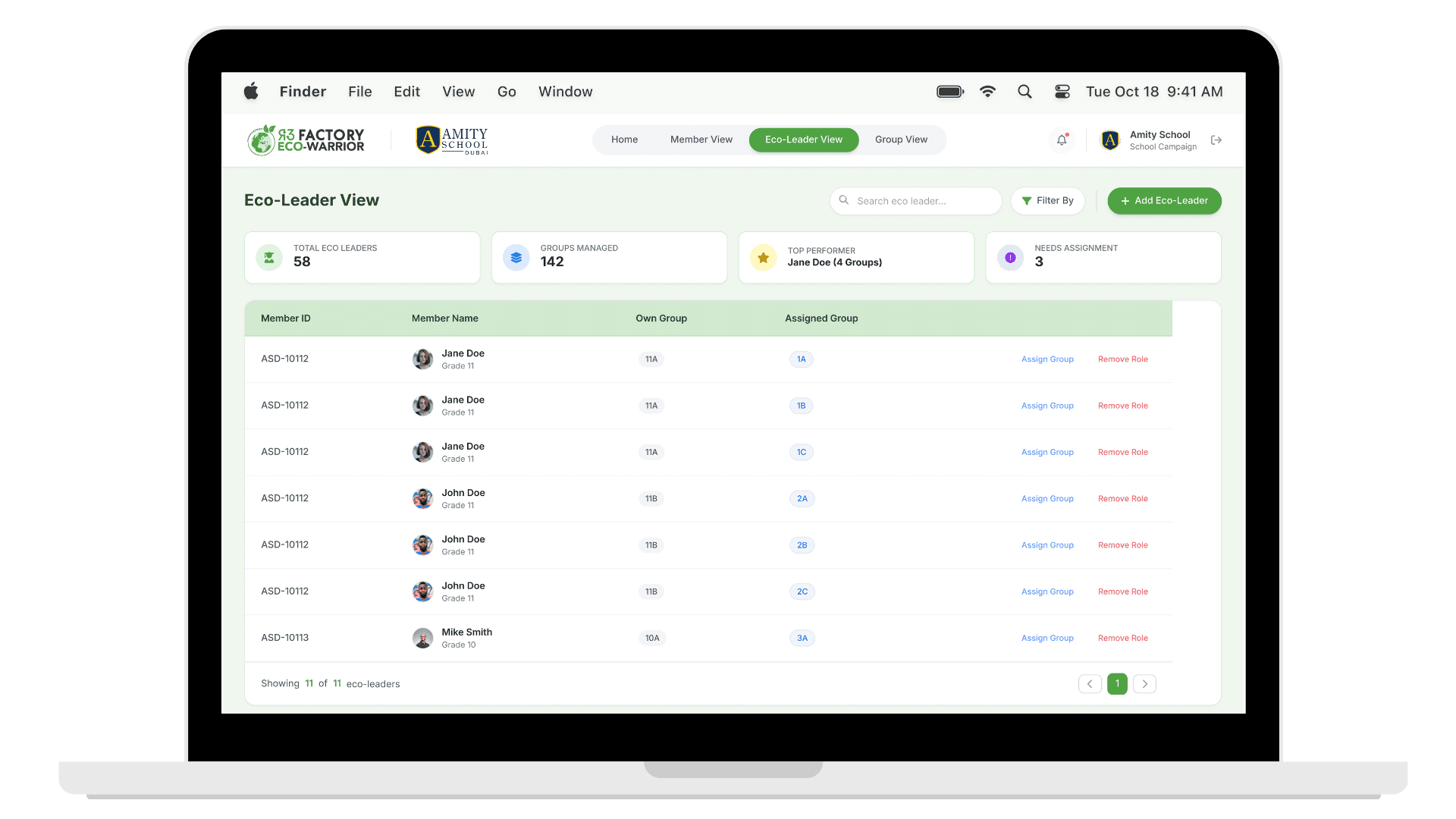
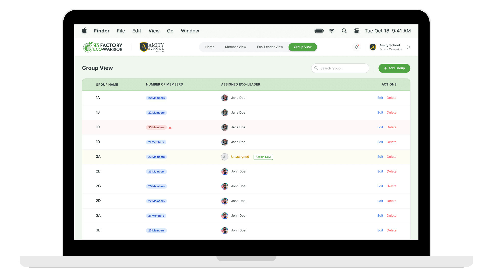
Load visibility and balance
What changed Eco-leader assignments and group sizes were made clearly visible across the system. Why it mattered Eco-leaders are students with limited capacity. Overloading them would make the program unsustainable. How it improved the experience Teachers could spot imbalance early and redistribute responsibility before it became a problem.
Using a component library
What changed A component library was used instead of designing and building everything from scratch. Why it mattered Time and development resources were limited. Prioritizing speed and consistency mattered more than custom components. How it improved the experience The product shipped on time, stayed consistent across screens, and allowed focus on solving operational problems rather than rebuilding UI patterns.
Supporting Design Work
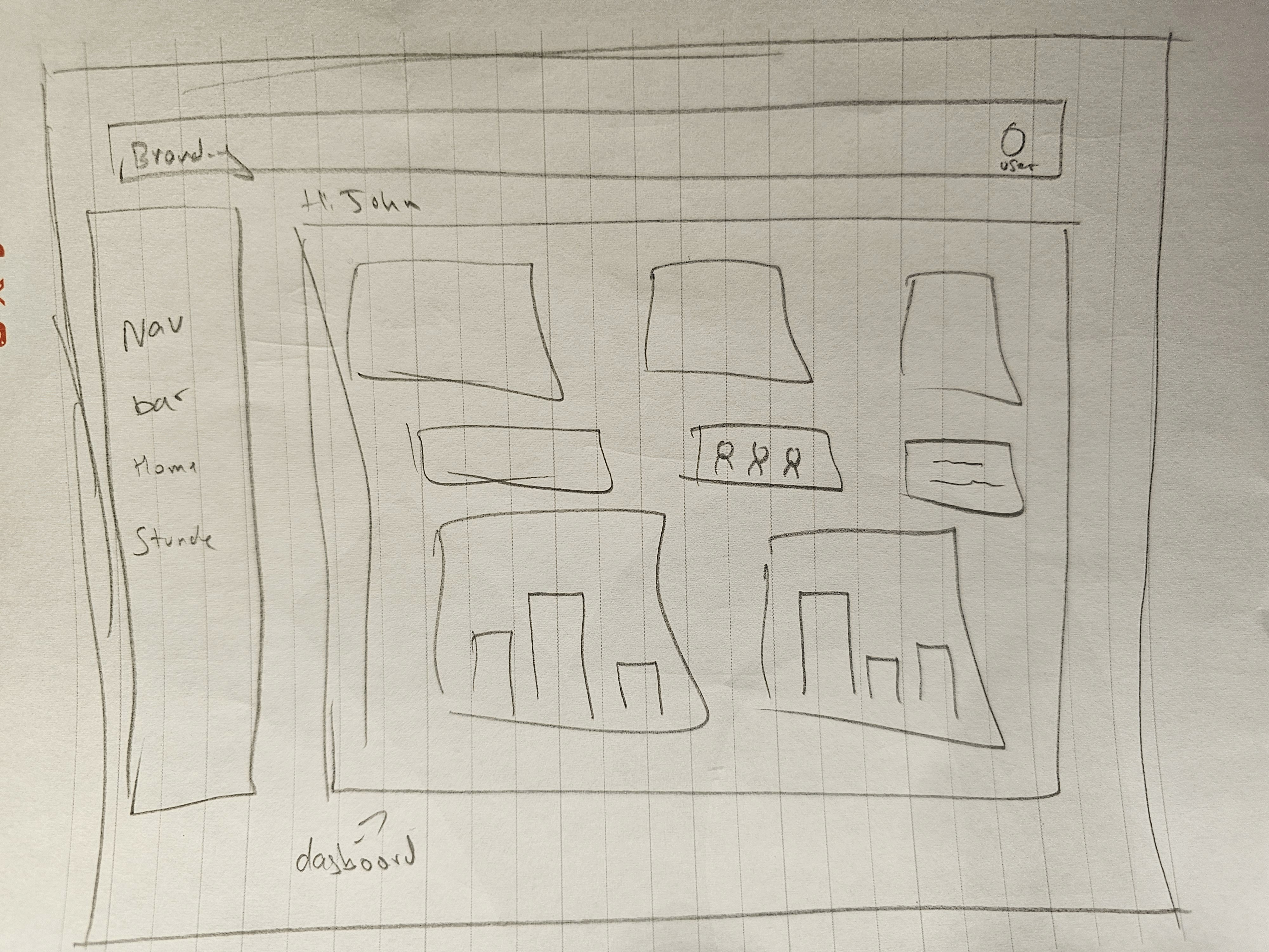
Before moving into high-fidelity designs, I explored the structure of the system through lightweight research, flows, and early sketches.
The focus at this stage was not visual polish. It was understanding how information needed to be organized, how different roles interacted with the system, and where friction could be removed early. These explorations helped validate direction before committing to detailed UI work.
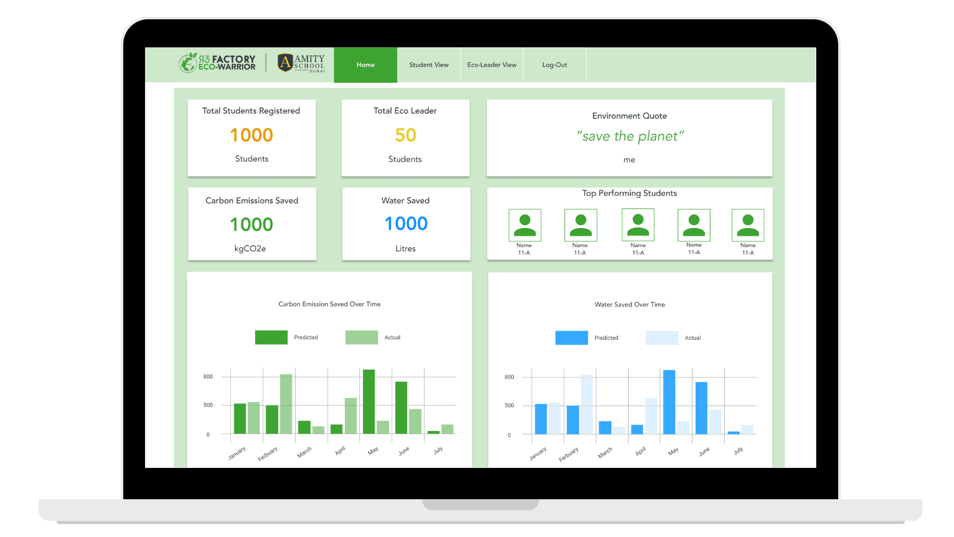
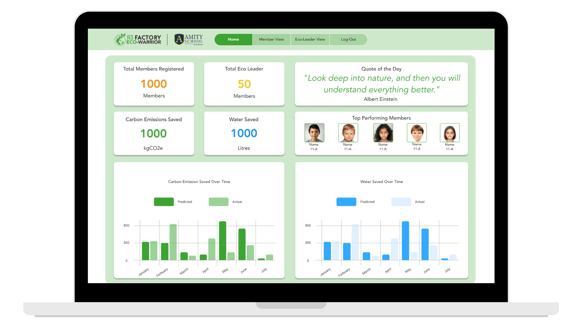
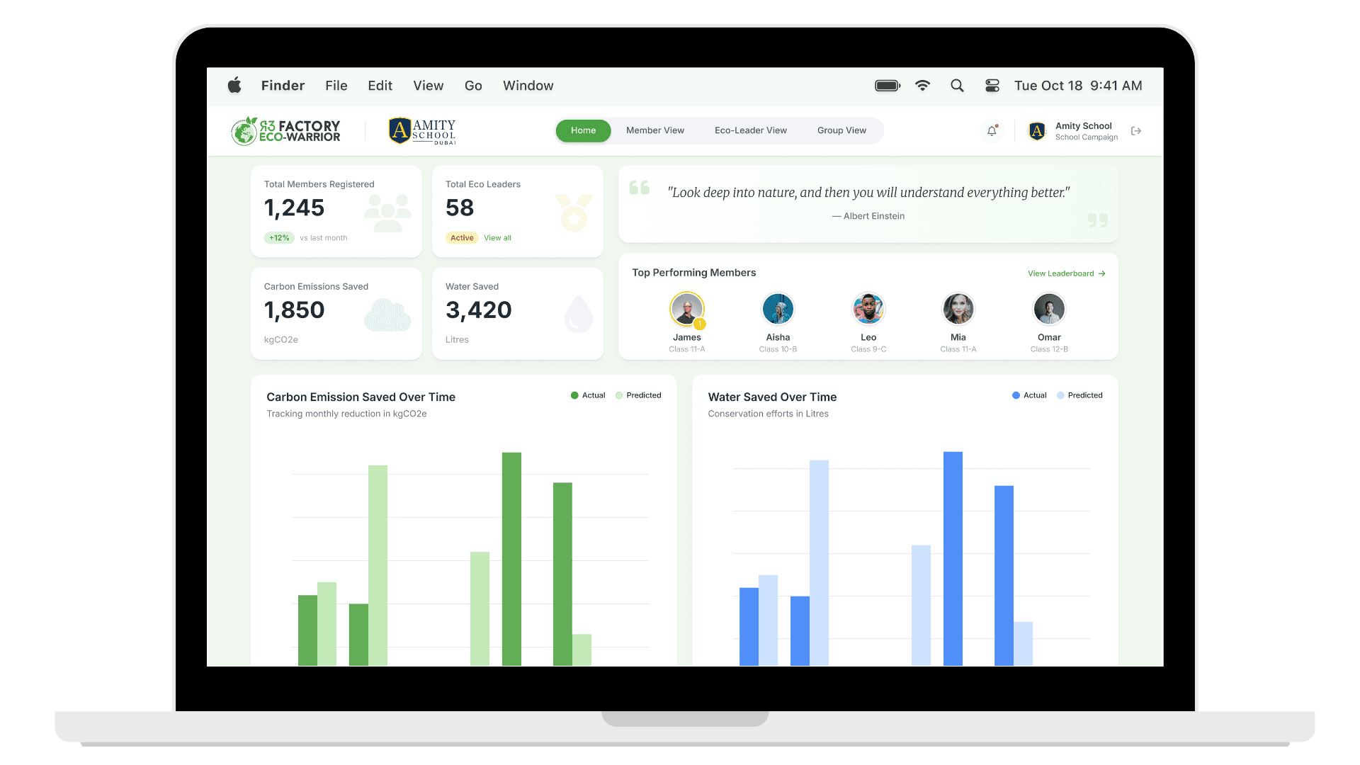
Final System Design
The final design brings the system together into a clear, web-based admin experience.
The interface prioritizes visibility, efficiency, and consistency. Key actions are easy to find, system status is visible at a glance, and common tasks are designed to work at scale rather than one at a time.
The screens below show how the system supports bulk onboarding, group management, role assignment, and ongoing oversight.
Prototype
Below is a high-fidelity interactive prototype of the Eco-Warrior Admin Portal.
The prototype focuses on the core system flows that mattered most for this version of the product. It reflects the decisions made to remove operational bottlenecks, support scale, and ship a reliable MVP under real constraints.
Beneath it, I’ve outlined what I intentionally chose not to build, along with key reflections from designing and shipping this system.