Improving onboarding to increase conversion - OPTEAM
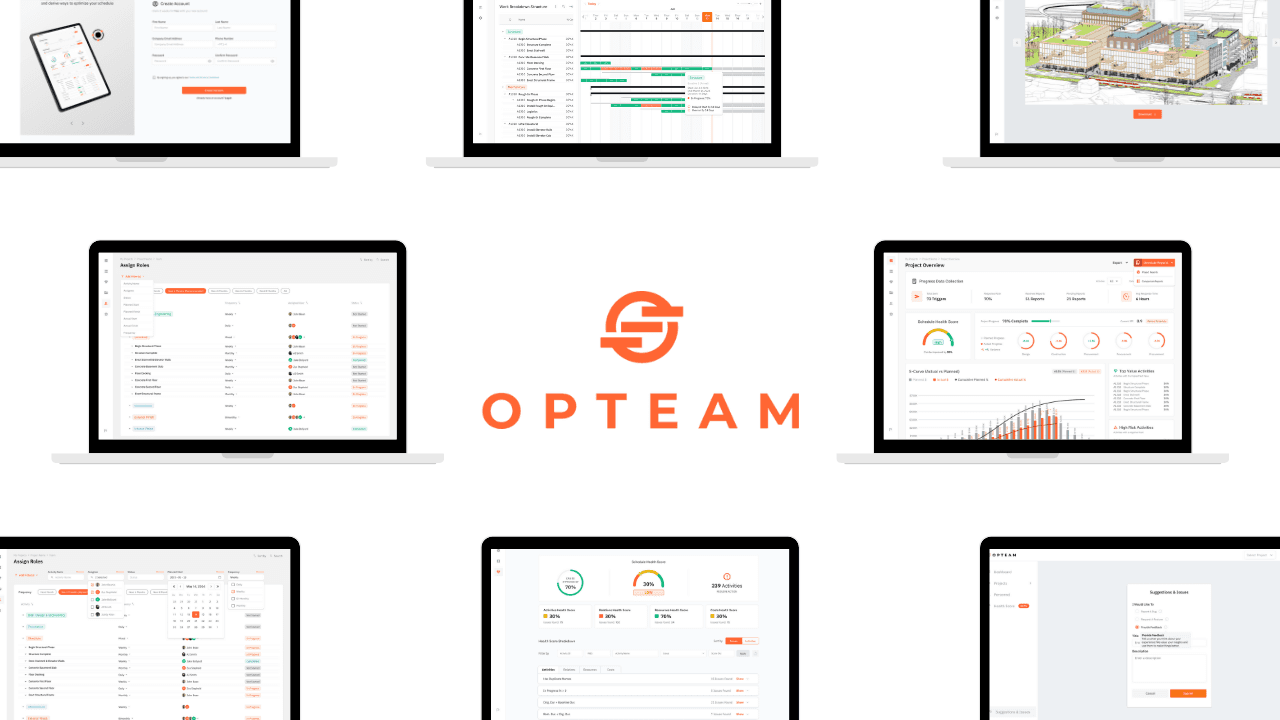
Product design work focused on improving OPTEAM’s signup and onboarding experience.
This was done by reducing friction, clarifying system requirements, and helping new users reach the product’s core value faster and with less frustration.
Product Design
SaaS
UX Design
UI Design
Web Design
System Design Thinking
Corporate Work
Project Role:
Product Designer & Researcher
Project Timeline:
December 2024 to January 2025
Project Overview
The Real Problem
OPTEAM is a SaaS platform for managing large-scale construction projects.
At the time of this work, many potential customers were dropping off during signup. The onboarding flow asked for too much information upfront, lacked clear validation, and didn’t account well for international users.
This friction had a direct business impact. A large number of users never made it past the first step, meaning they never reached the product during the free trial.
My goal was to reduce this friction without redesigning the entire system, using the OPTEAM design system. I focused on simplifying signup, improving clarity at key moments, and helping users reach the product faster within tight technical and resource constraints.
Impact
What changed
The signup experience was simplified and made more transparent, allowing users to understand requirements, fix errors quickly, and complete onboarding with less effort.
What this enabled
Signup progression increased from 30.1% to 59.1%
Fewer users dropped off early in the onboarding flow
More users reached the product and began exploring it during the trial
These improvements were measured using Hotjar funnel analysis before and after the changes were shipped.
Reflections and Key Learnings
This project reinforced the importance of designing for real constraints.
Instead of trying to redesign the entire onboarding journey, I focused on removing the most painful points that were blocking users from getting started. Small, targeted changes around clarity, validation, and flow structure made a measurable difference.
It also highlighted how closely UX decisions can tie into business outcomes. Improving the signup experience was not just about usability. It directly affected conversion, trial engagement, and revenue potential.
What I chose not to do
I did not redesign the full onboarding journey beyond signup
I did not change pricing, trial length, or core product architecture
I avoided adding unnecessary features and focused on simplifying what already existed
Given the constraints of a startup environment, prioritizing clarity and speed over polish allowed the team to ship meaningful improvements quickly.
Key Design Decisions
The biggest challenge in this project was not visual design. It was reducing friction under real constraints.
Time, development capacity, and technical limitations meant I had to be intentional about what to change, what to simplify, and what not to touch. The decisions below reflect how I approached improving conversion by removing blockers rather than adding complexity.
Simplifying signup form
What changed I reduced the number of required fields during signup and deferred non-essential information until later. Why it mattered Asking for too much information upfront increased cognitive load and caused users to abandon the flow before completing account creation. How it improved the experience Users could move forward with less effort and less hesitation, making the first step feel achievable instead of overwhelming.
Password requirements
What changed I introduced clear, inline password requirements instead of showing a generic “invalid password” error. Why it mattered Users were repeatedly failing password validation without knowing why, leading to frustration and trial-and-error behavior. How it improved the experience Users could immediately see what was required and adjust their input with confidence, reducing failed attempts and drop-off.
Error feedback & validation
What changed I added clearer validation states for inputs like email, phone number, and password. Why it mattered Vague error messages left users guessing, especially international users whose inputs were technically valid but incorrectly flagged. How it improved the experience Errors became understandable and actionable, allowing users to recover instead of abandoning the flow.
Adding Google sign-in
What changed I added Google login as an alternative to manual account creation. Why it mattered Many users already had Google accounts, and offering a familiar option reduced effort and perceived risk. How it improved the experience Users could create accounts faster with fewer inputs, lowering friction at the very first interaction.
Removing sign up steps
What changed Instead of asking users to download and re-upload a demo file, I dropped them directly into the product with a ready demo project. Why it mattered The extra step delayed time-to-value and added unnecessary friction after signup. How it improved the experience Users could immediately explore the product and understand its capabilities without setup overhead.
A/B Testing
I explored two approaches for displaying password requirements. One version showed all rules upfront and updated dynamically as users typed. The other revealed requirements only when needed, but without live feedback.
Through testing, it became clear that each approach solved only part of the problem. I combined them into a single solution that keeps the interface clean while still updating dynamically based on user input. This way, guidance appears when it’s needed, and users can immediately see what they’re missing without added clutter.
The final approach reduced cognitive load, improved clarity, and was simpler for the engineering team to implement.
Supporting Design Work
Alongside the onboarding refresh, I also worked on improving supporting areas of the product that helped teams work more efficiently and share feedback.
These changes were not the primary driver of conversion impact, but they contributed to overall usability and product maturity.
Designed the Issues and Suggestions flow, allowing users to report problems, request features, or share feedback directly from the product
Worked on Filtering Interactions to help users navigate projects and tasks more efficiently
Collaborated closely with engineering to ensure designs were feasible and aligned with existing system patterns


