Building Trust and Cultural Relevance with Visual Design
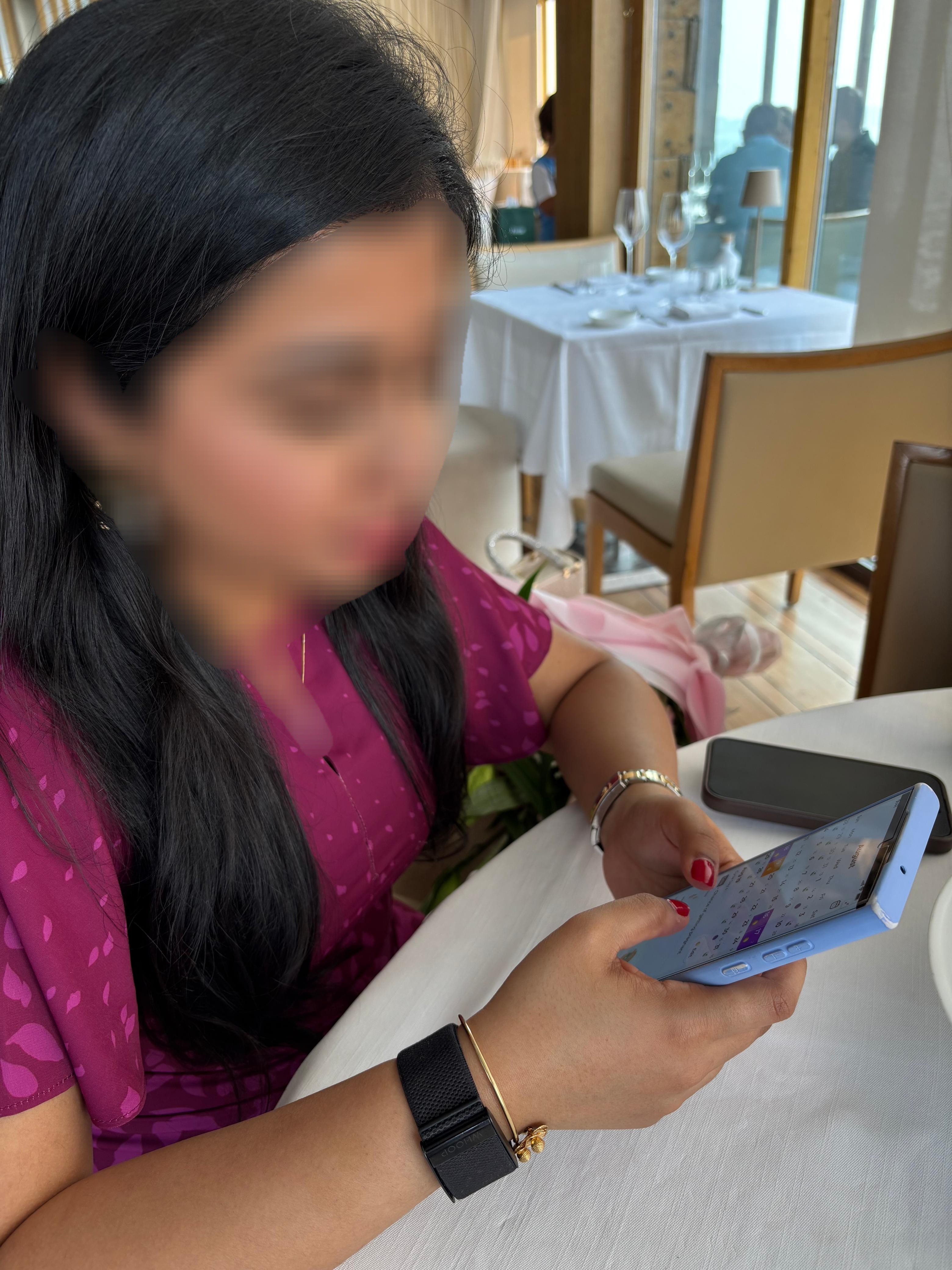
Qamar Glow is a menstrual cycle insights iOS app designed specifically for Muslim women.
I was brought on as a freelance product designer to create both the brand identity and the end-to-end app experience.
The goal was to turn an early AI-generated concept into a trusted, culturally relevant product women could genuinely connect with.
End to End Design
Branding
Logo Design
UX Research
UI Design
UX Design
Mobile Design
Design System
Client Work
Project Role:
Product Designer & Researcher
Project Timeline:
April 2025 to July 2025
Project Overview
The Real Problem
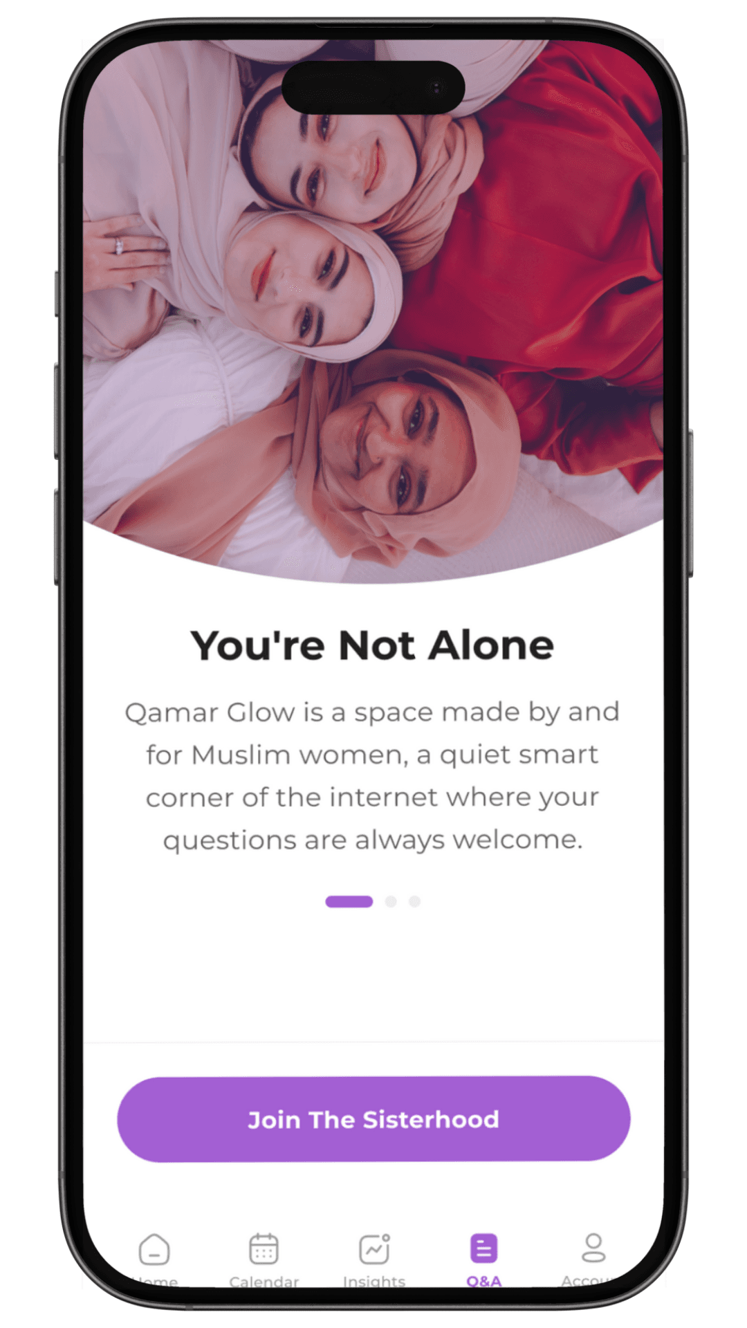
It wasn’t a visual problem. It was a trust problem. Most period-tracking apps are built for a generic audience. For Muslim women, they often feel culturally disconnected in tone, language, and design.
On top of that, key parts of daily life were fragmented across tools:
Periods tracked in one app
Missed fasts tracked in notes
Partner communication handled awkwardly, if at all
For many women, especially in arranged marriages, discussing menstruation directly can still feel socially uncomfortable. Existing apps offered no emotionally safe way to bridge that gap.
The result was not a lack of features. It was a lack of belonging. The product worked, but it did not feel made for them.
Impact, Reflections and Key Learnings
Beneath it, I’ve shared the expected impact of this work, what I would approach differently in a future version, and the key lessons this project reinforced for me.
Expected impact
What I expect to change This redesign is intended to help Muslim women feel represented rather than generalized. Why this matters Health products rely on trust. If users don’t feel understood, they won’t stay. What success would look like A product that feels personal, culturally aware, and emotionally safe, not just functional. These outcomes are expected based on my testing and feedback, and have not yet measured.
What I chose not done
What I chose to leave out I did not try to design every possible wellness feature. Why this mattered This was an MVP. Adding too much would have diluted the core experience. What this decision protected By focusing on the essentials such as cultural relevance, clarity, and trust. For me smaller, stronger product was more valuable than a larger, unfocused one.
Reflection
What this project reinforced Not every decision is about users alone. Strong product work means balancing user needs with business realities. What I learned as a freelancer Large projects require realistic expectations, prioritization, and knowing when to move forward rather than perfect every detail. How this shapes my future work This project strengthened my judgment around focus, trade-offs, and shipping meaningful products, not just polished screens.
Design Direction
At the start of the project, I was given a clear brief: the app name, core features, a general aesthetic direction, and an AI-generated prototype.
The prototype worked as a foundation, but it was generic. It showed what the app could do, not how it should feel.
My focus was not to add more functionality. It was to reshape how the product felt.
I wanted to move the experience from:
Clinical → Personal
Generic → Culturally grounded
Data entry → Self-understanding
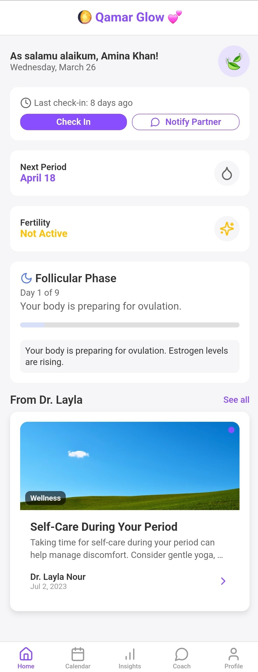
The idea was simple. This app should feel like a companion that understands a woman’s life, not just her cycle.
Key Design Decisions
The redesign focused on creating a calm, familiar experience that also felt culturally meaningful.
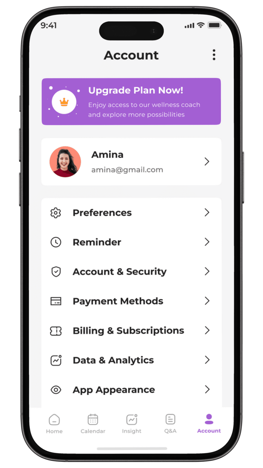
I kept the interface clean and minimal so the app stays easy to use and emotionally light. Nothing was added unless it improved clarity or trust.
Cultural relevance was built into the experience itself through language, icons, and interactions, not layered on top.
The app also follows familiar iOS patterns to keep the learning curve low.
The decisions below highlight where this direction mattered most.
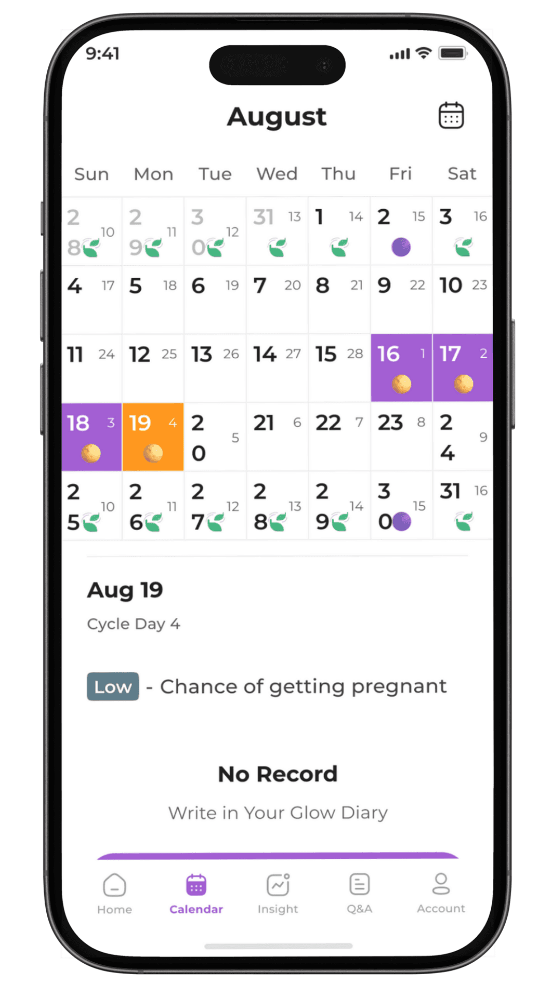
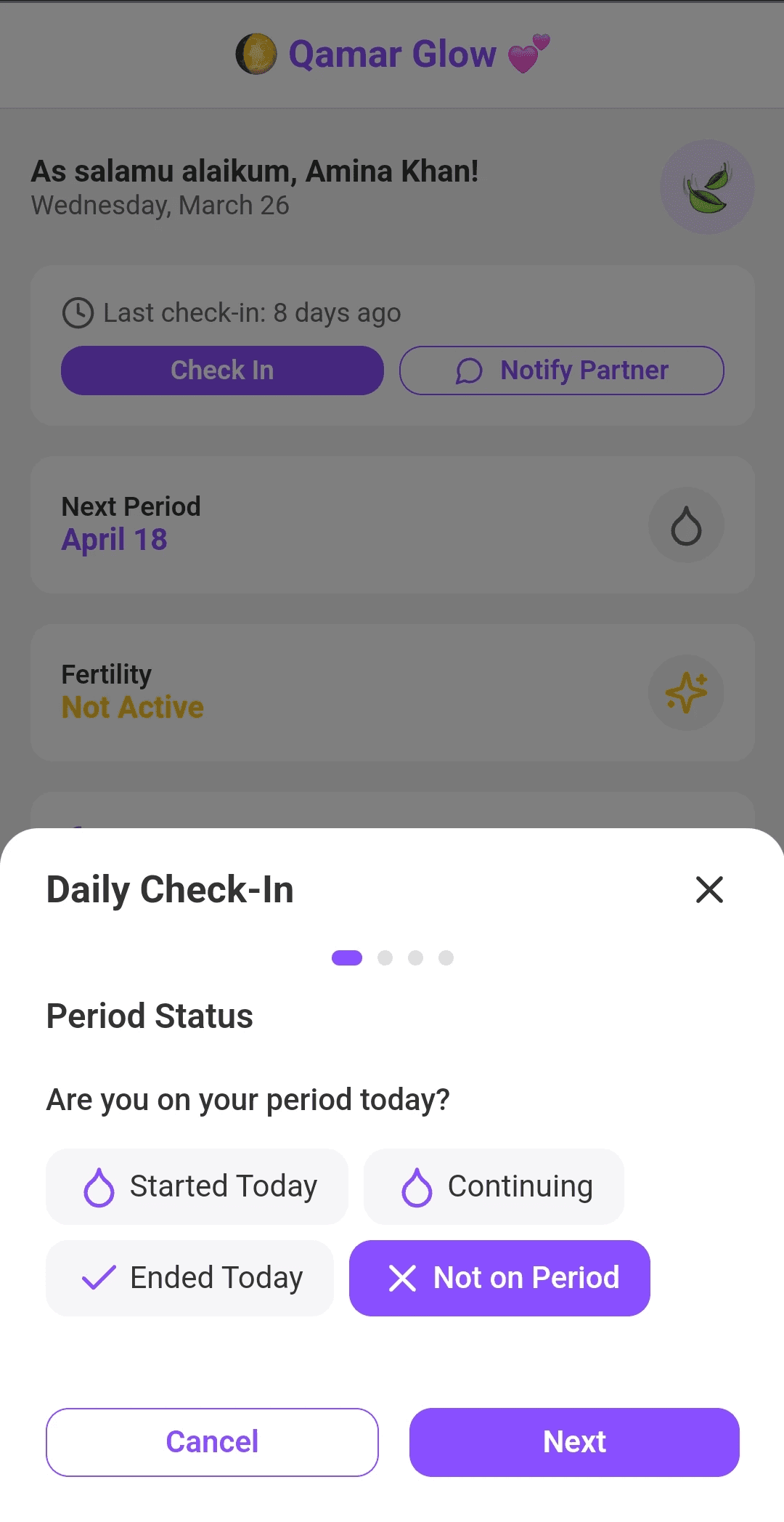
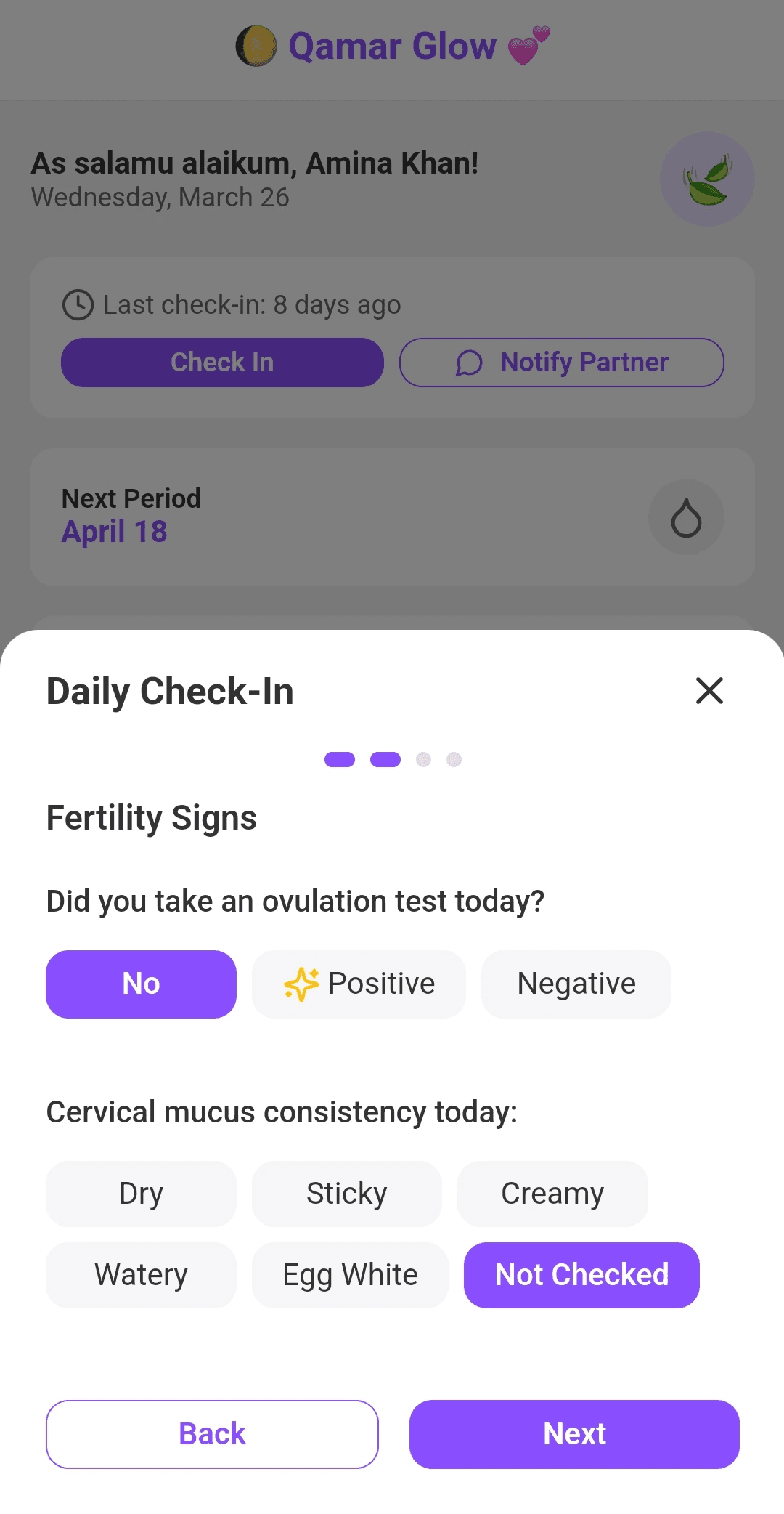
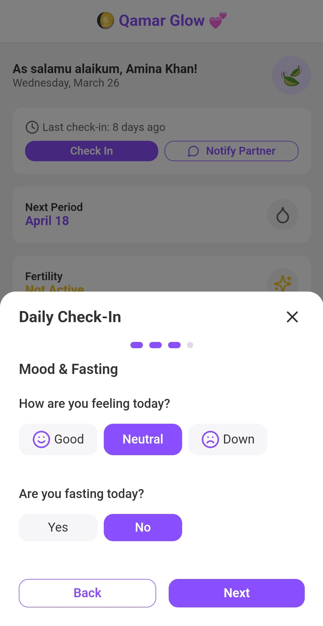
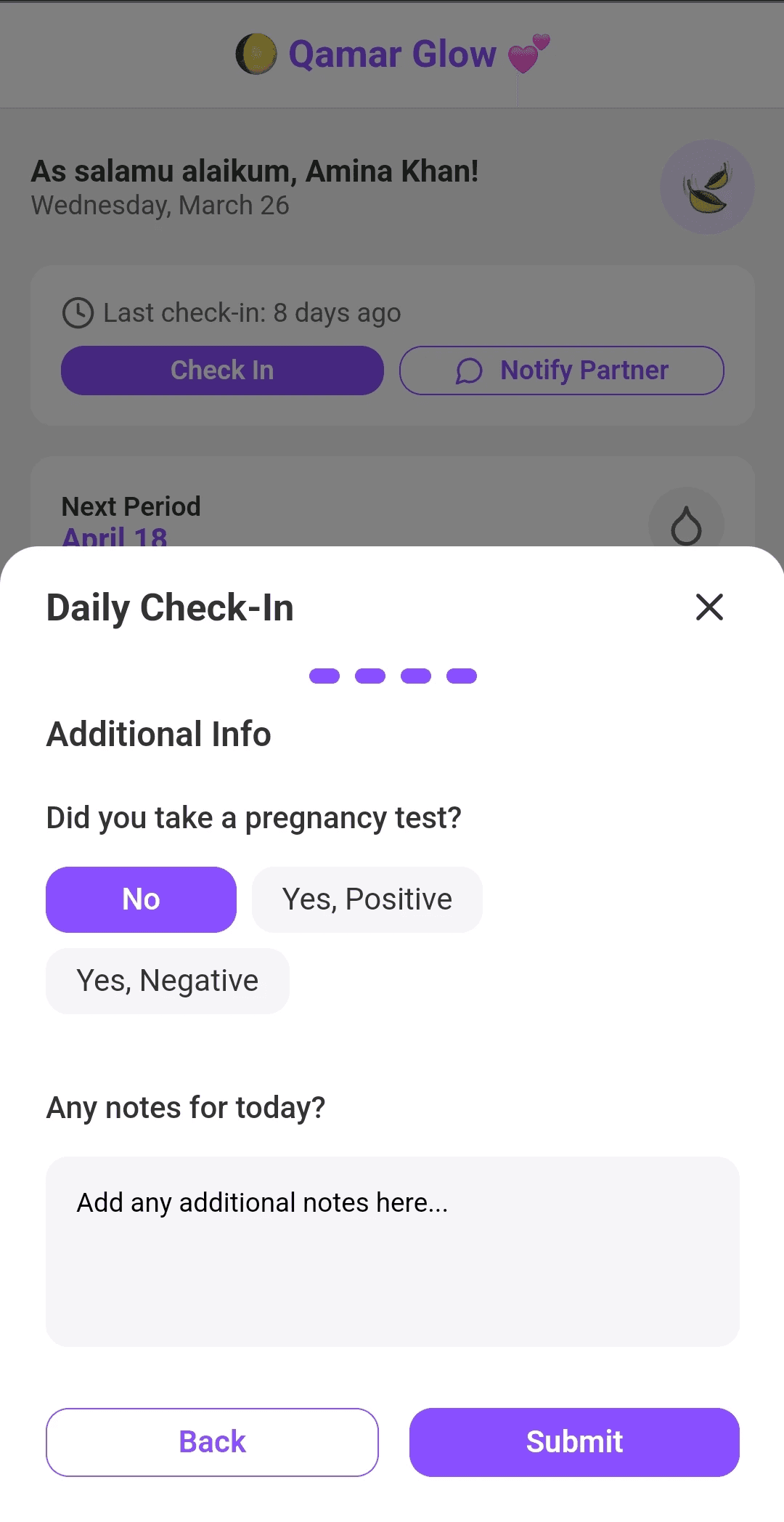
Reframing period tracking
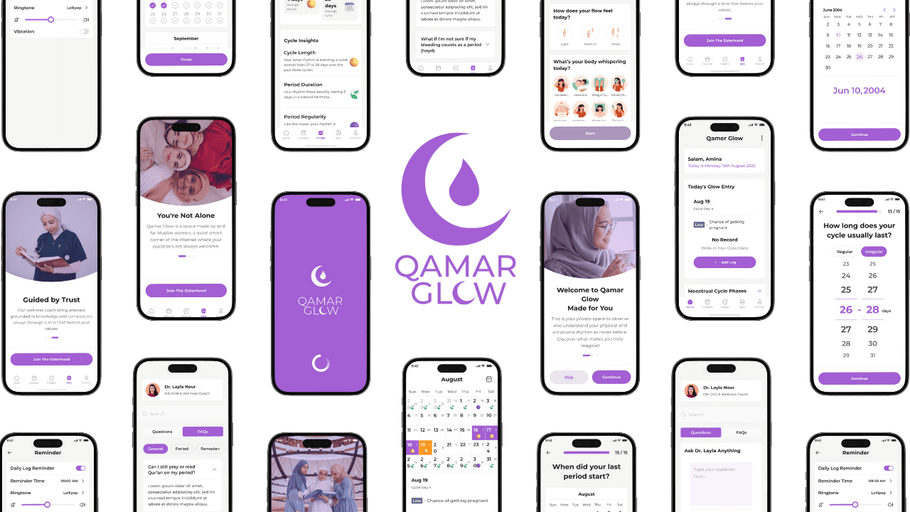
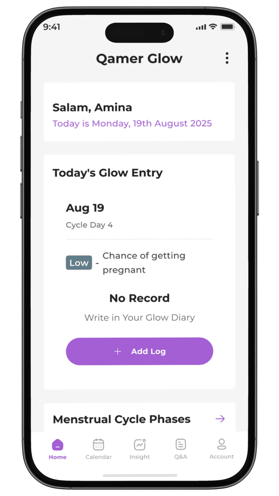
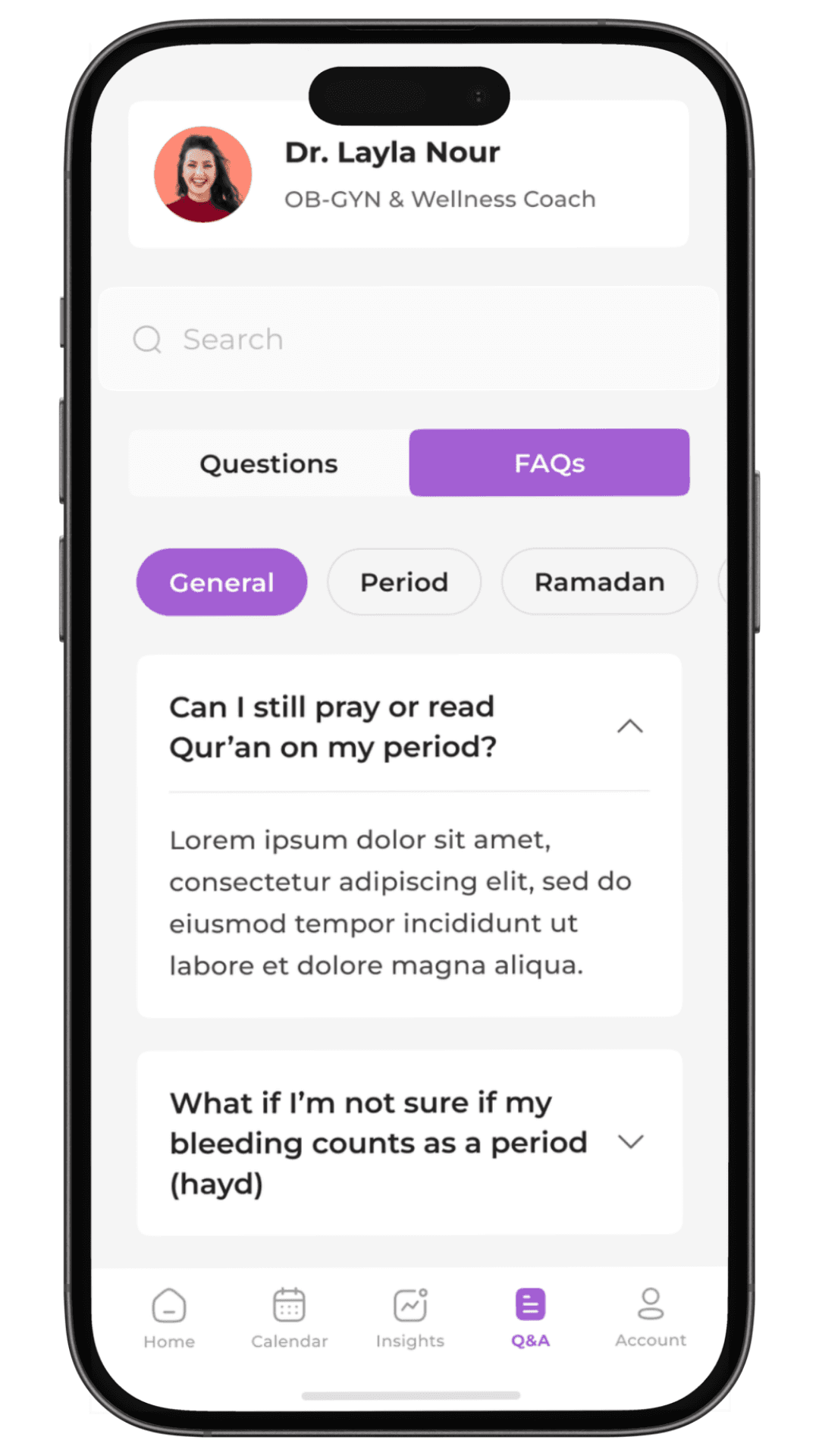
What changed The original app treated tracking as medical logging. I reframed it as a daily reflection experience, from “Period Log” to “Glow Diary,” with emotional and spiritual check-ins alongside physical symptoms. Why it mattered A clinical tone made the app feel distant and impersonal. How it improved the experience Women stopped just entering data and started engaging with their cycle as part of their identity and faith.
Replacing clinical symbols
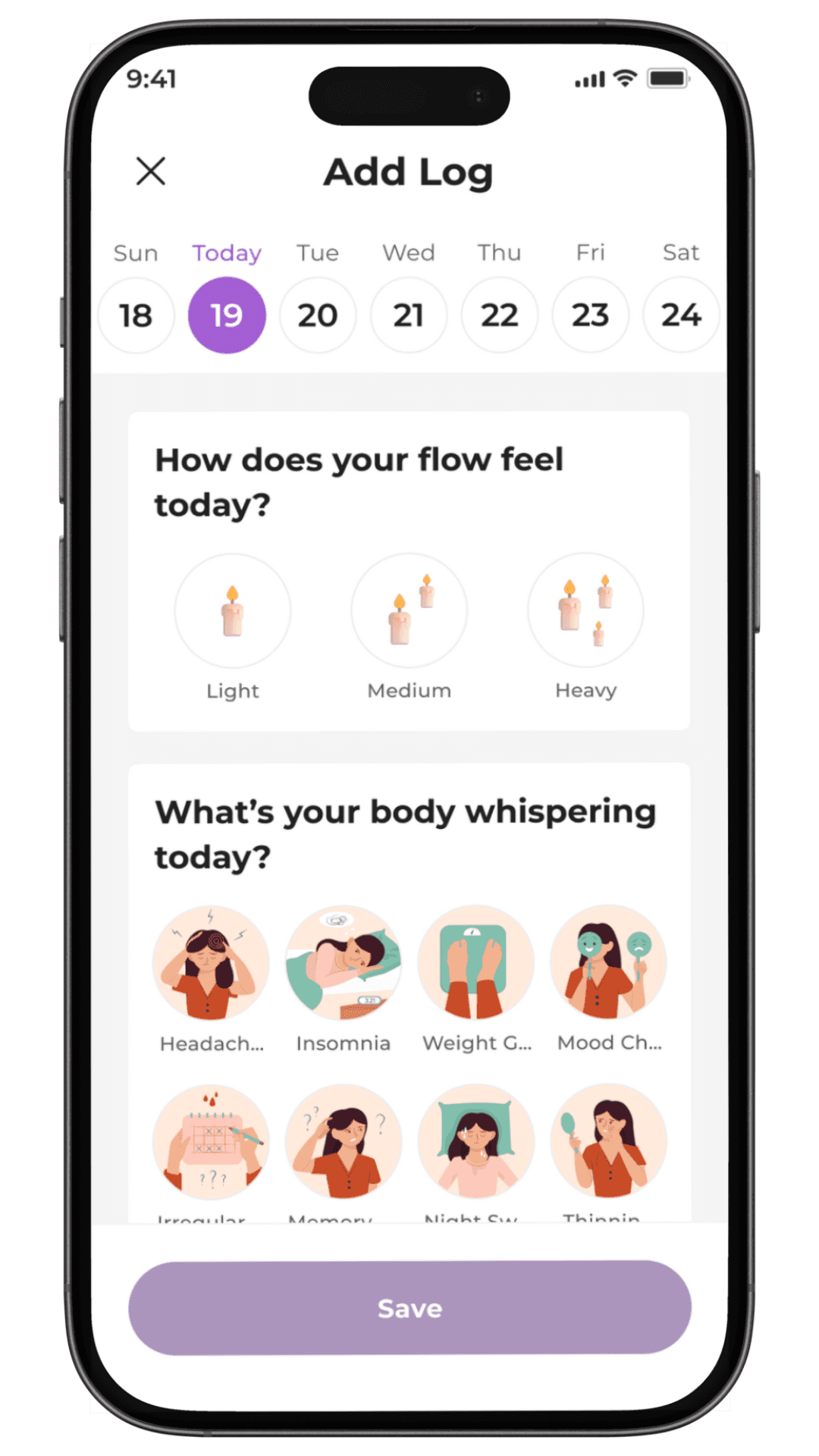
What changed I replaced blood-drop icons with glowing candles to represent flow intensity. Why it mattered Many users found standard medical visuals uncomfortable. How it improved the experience The metaphor reframed menstruation as natural and meaningful, making the interface emotionally safer to use daily.
Upgrading partner notifications
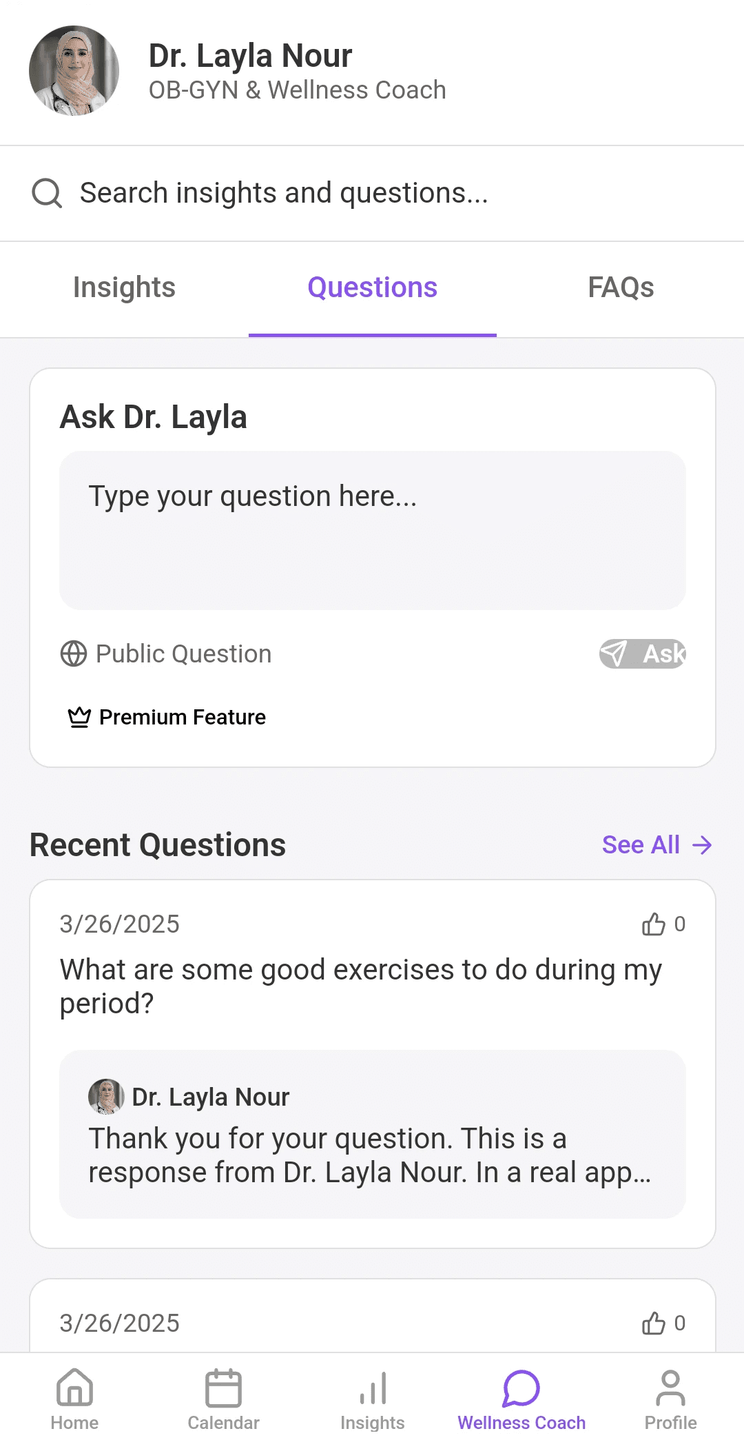
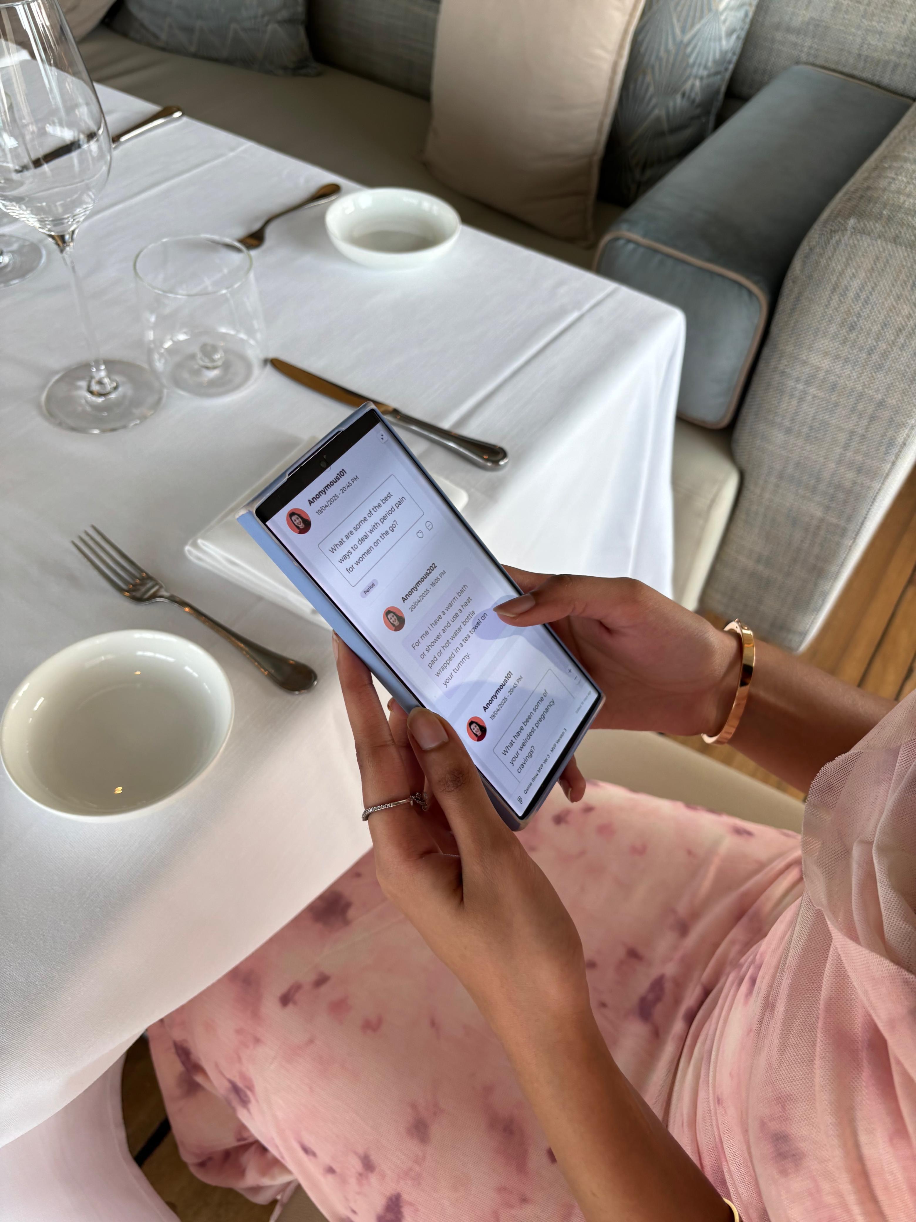
What changed The original feature sent basic reminders. I added the ability to choose supportive messages or write personal notes, delivered via WhatsApp. Why it mattered For many users, this is about socially safe communication, not just convenience. How it improved the experience It turned a mechanical alert into a gentle bridge between partners.
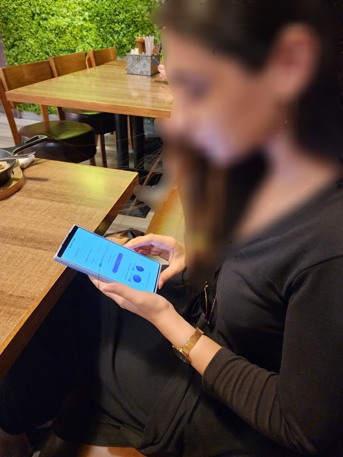
Unifying period logging
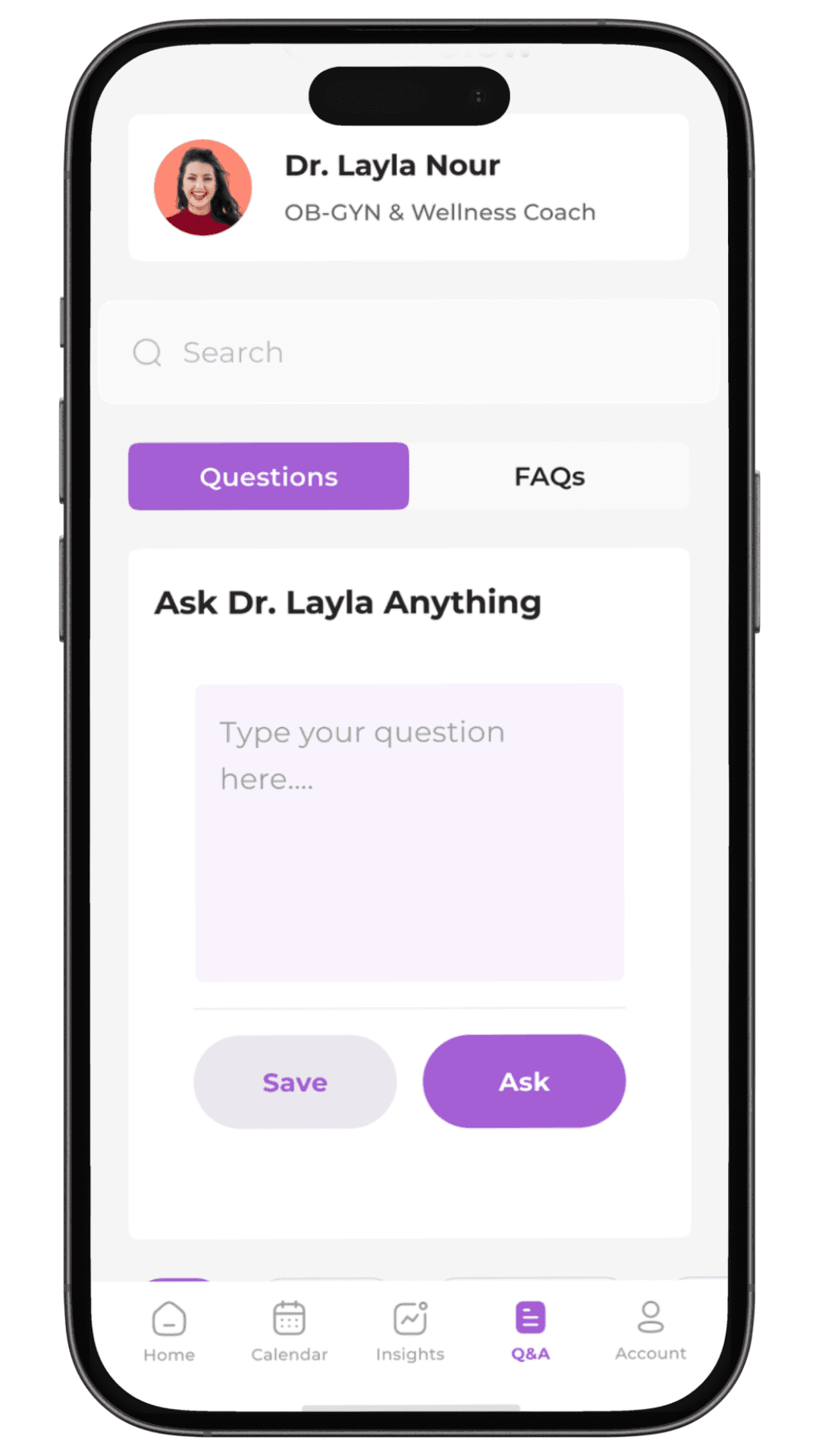
What changed Logging was split across multiple screens. I combined flow, symptoms, and mood into one calm check-in. Why it mattered Multi-step forms increase friction and drop-off. How it improved the experience Daily tracking became faster, lighter, and easier to maintain.
User Testing
User testing was used to validate not just usability, but emotional clarity.
Small details in a health app can quietly shape trust, comfort, and long-term use. Testing helped surface mismatches between intention and experience, and guided a few key refinements that made the product feel more coherent and accessible.
The examples below highlight where feedback led to meaningful change.
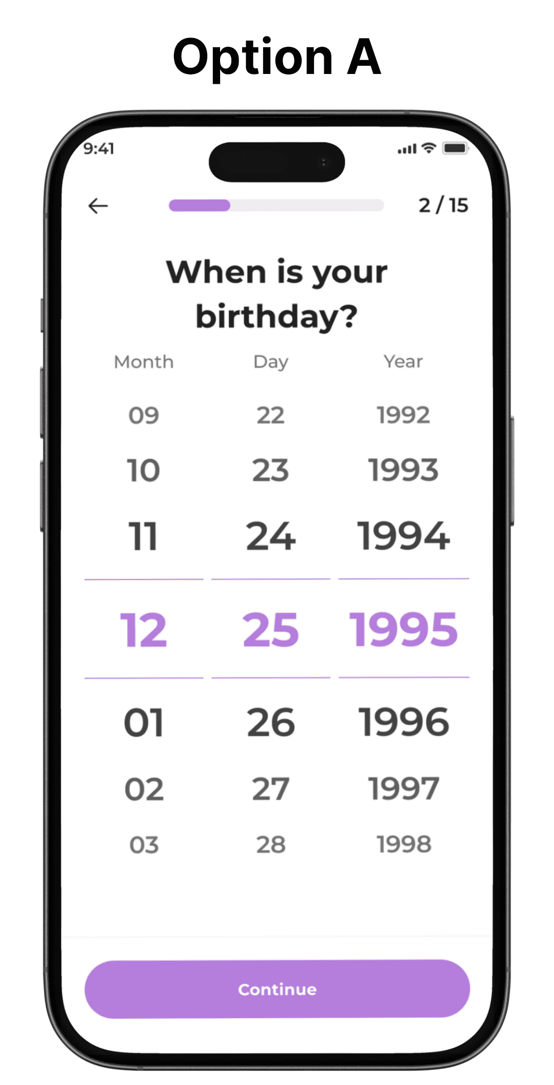
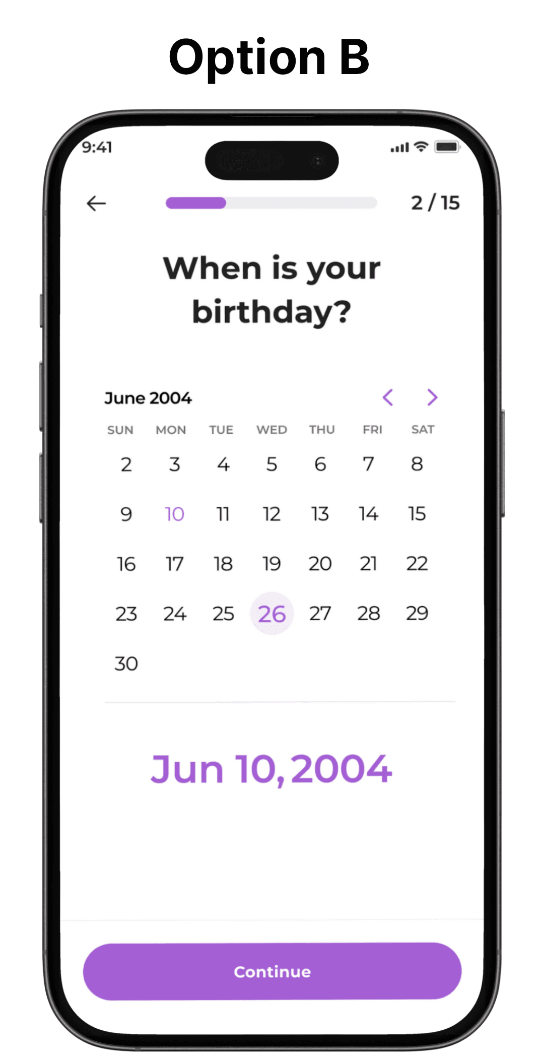
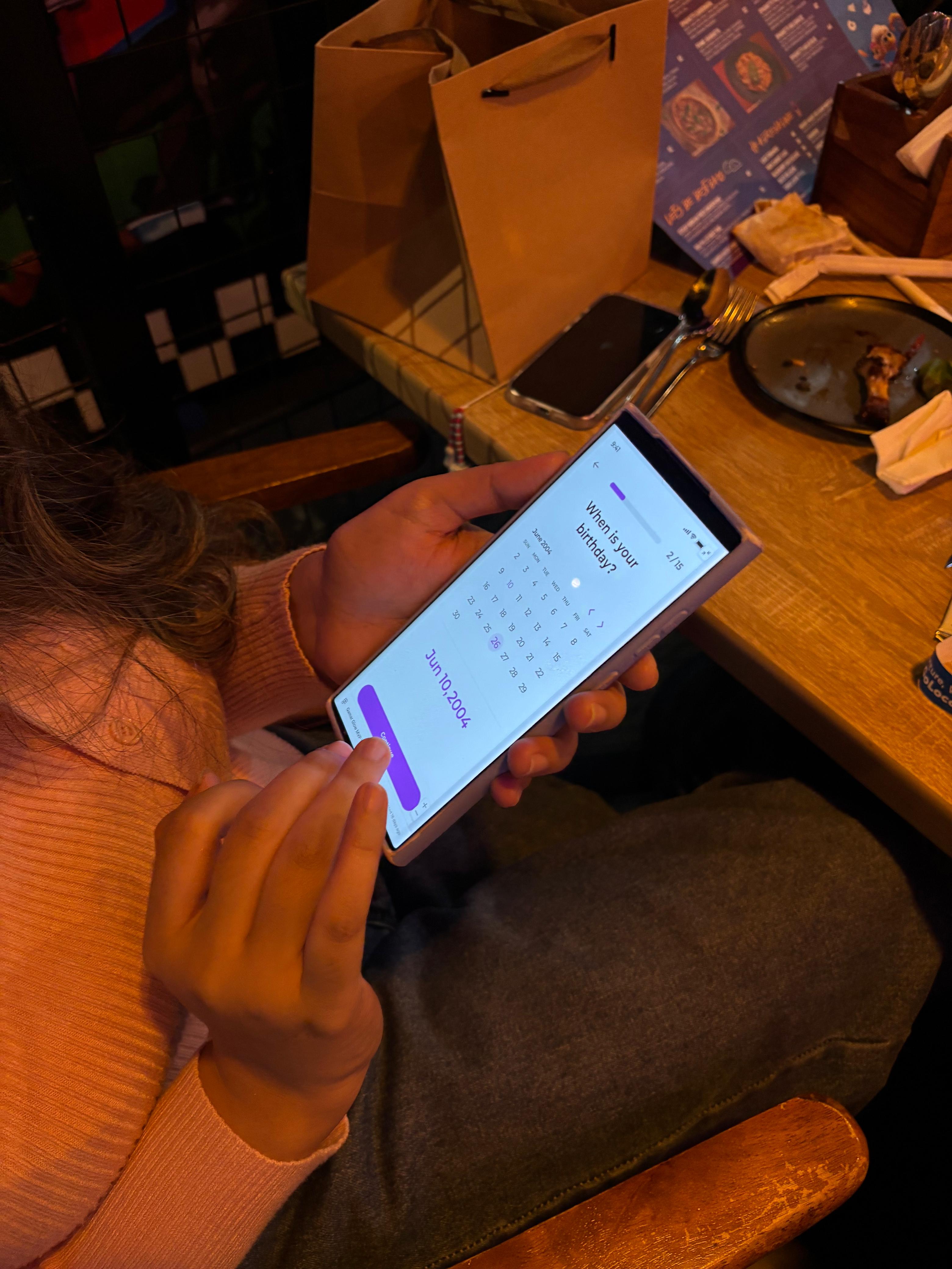
In-person usability testing was conducted in everyday environments to reflect real-world use.
Participants completed key flows such as creating an account, logging a cycle entry, checking the calendar, tracking missed fasts, posting in the community, and changing language settings.
Most tasks were completed smoothly. The main issue surfaced around language settings, which were originally buried under “Preferences.”
Based on this feedback, language settings were moved into a clear, dedicated section.
This final round of testing confirmed that the core experience was ready for development handoff.
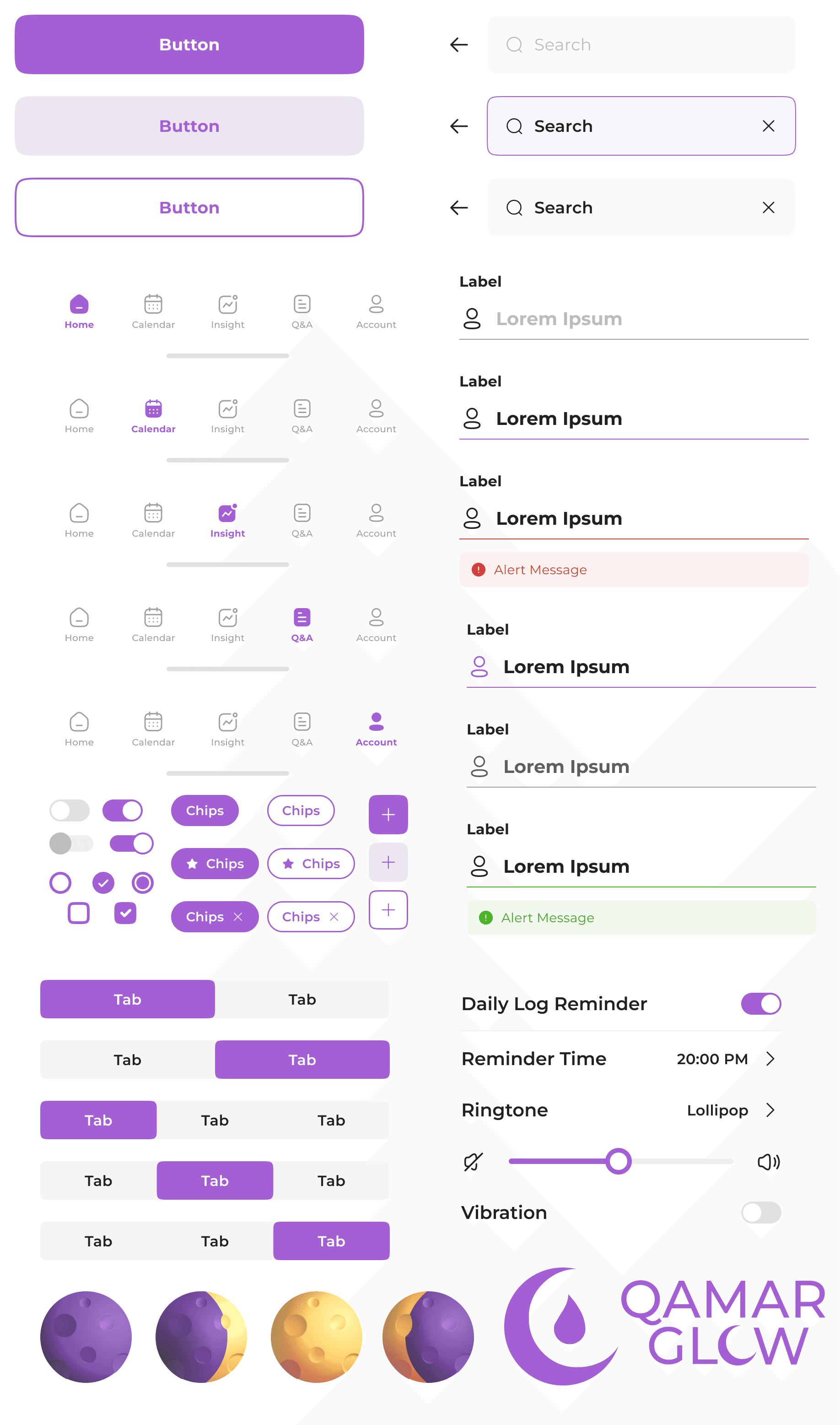
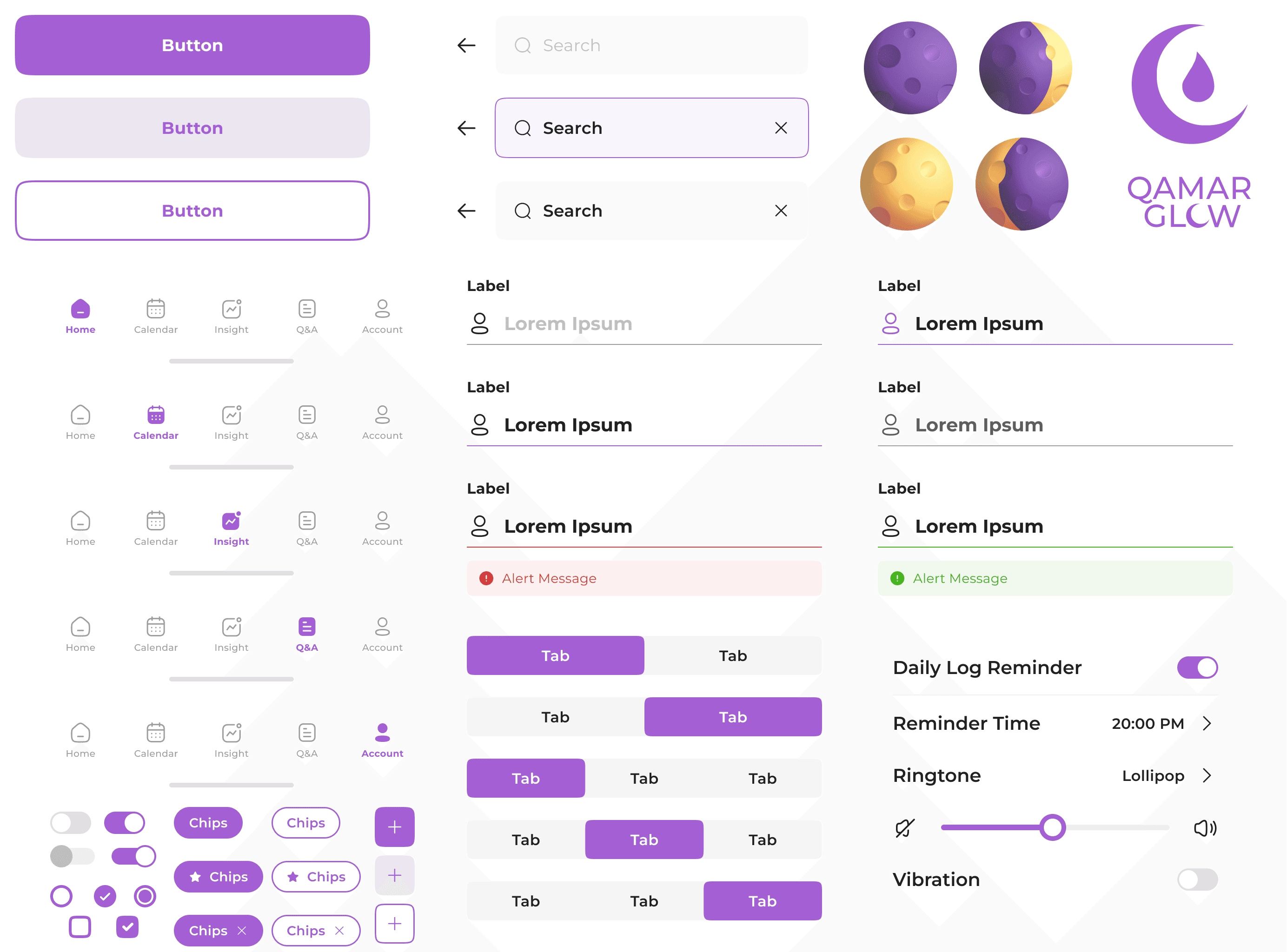
Design System and Branding
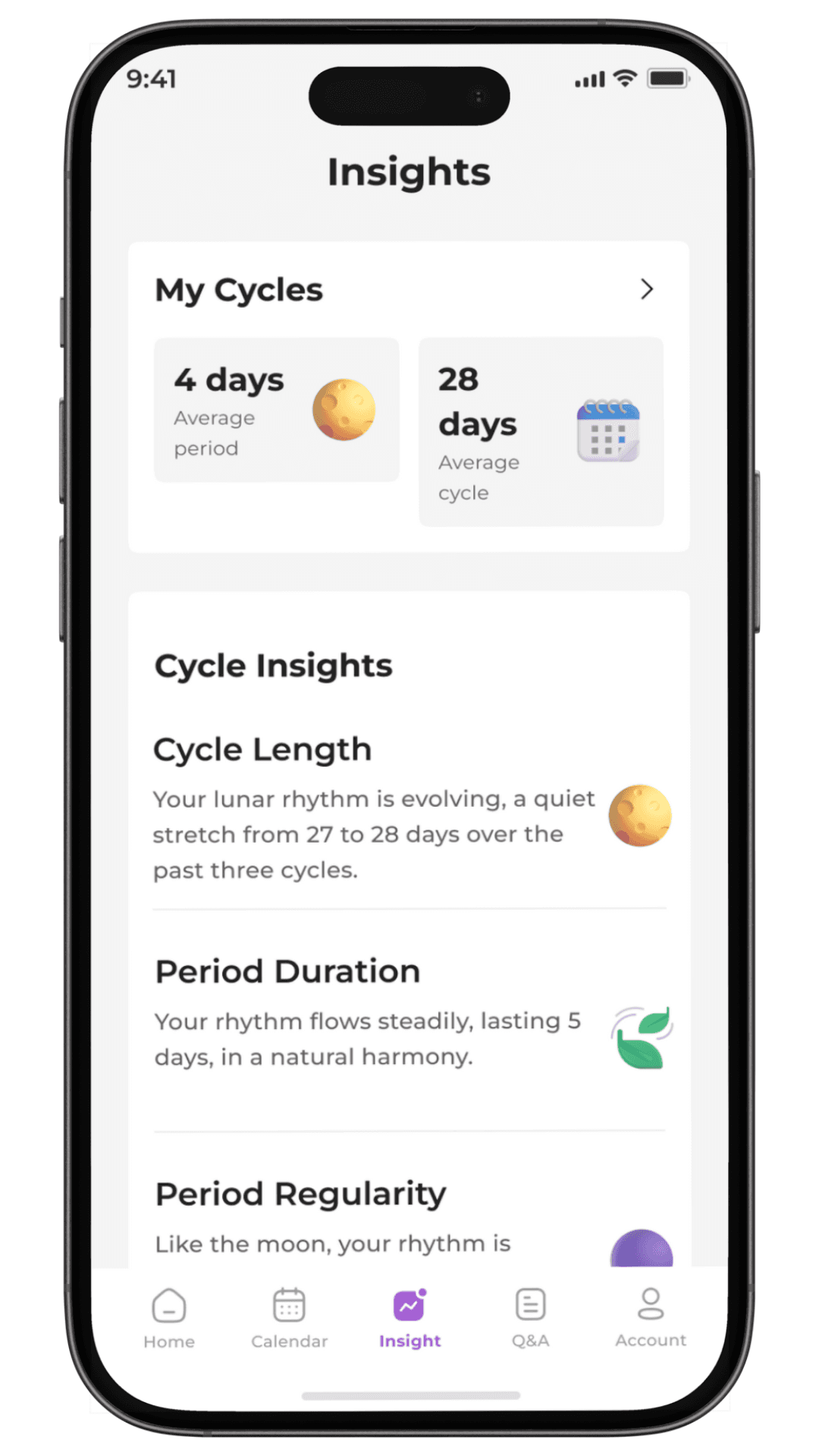
The name “Qamar Glow” comes from the Arabic word Qamar, meaning moon. Since the menstrual cycle follows a monthly rhythm, the moon became a natural symbol for the brand.
This thinking shaped the visual identity. A soft purple palette was chosen to feel calm and feminine without defaulting to the typical pink used by most period trackers.
Typography was kept simple and modern to support a clean, trustworthy product feel across both the app and marketing.
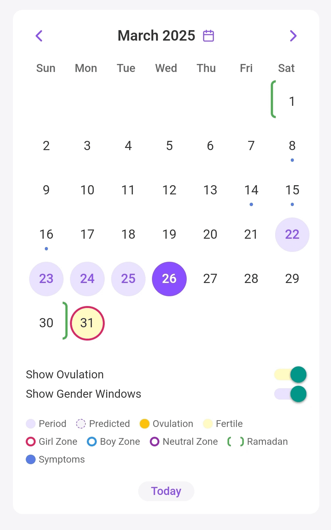
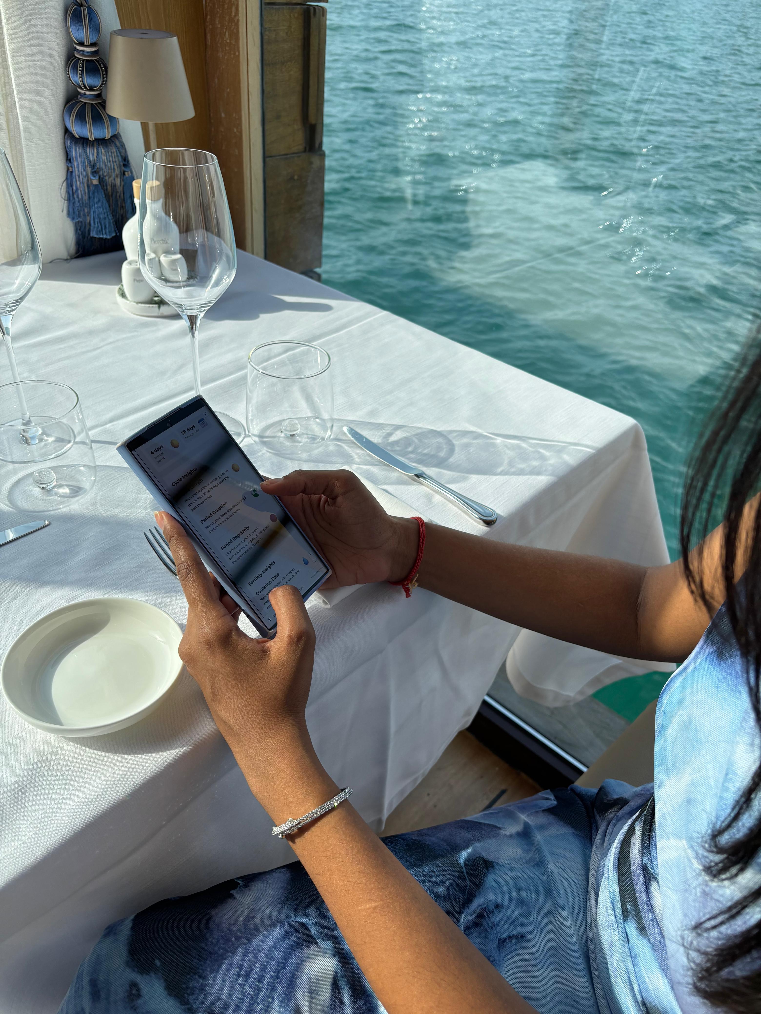
The design system was created once the core flows were defined to keep the product consistent as it grew. Core UI components and custom elements, such as the period calendar, were standardized early.
Its value became clear during testing. When users struggled with lighter colors, the palette was adjusted quickly and safely across the app. The system now supports consistency and makes future iterations more efficient.

Prototype and Reflections
Here is a fully interactive high-fidelity prototype of Qamar Glow.
It walks through the core experience, including:
onboarding
daily tracking
calendar insights,
community questions
fast tracking
partner communication.
This represents the main product flow rather than every possible edge case.
The prototype is meant to demonstrate how the product feels in practice, not just how it looks.